lunes, 8 de mayo de 2023

BASIC CONCEPS OF GRAPHIC DESIGN

The main function of graphic design is to communicate a message through an image, sometimes with text.

The designer creates the message using codes of graphic language, such as the composition, the typography and the colour.

The use of these codes depends on the type of media (press, television, internet, etc.), the cultural context, the characteristics of the audience, and the purpose of the message (informative, persuasive, educational, etc.).

Graphic design is used in many areas:

• Editing: design and layout of books, magazines and newspapers.

• Advertising: design of posters, billboards, leaflets and multimedia items (videos, web pages, etc.).

• Corporate identity (branding): design of the company’s image.

THE DESIGN PROCESS

1. Deciding the purpose

What is the message? Who is it for? How can it be created and communicated? What response is the message trying to provoke?

2. Collecting and analysing data

Study information about similar campaigns, characteristics of the target audience, possible media and techniques, etc.

3. Developing the proposal

4. Analysing the proposal

5. Selecting the final version

6. Production

Logos

Logos represent a company, an organisation or a service. A logo can have a single image or it can combine an image and text. Logos sometimes need to be updated to adapt to changes in trends, technology or the company's needs.

Signs

The purpose of signs is to inform. They use simple images that guide and instruct people.

In the past few decades, there have been many changes in the way graphics are produced. There are also more channels of communication.

However, the basic concepts of human communication are the same.

Graphic designers need to know about many areas, such as photography, freehand sketching, technical drawing, psychology, sociology, typography and technology. Even so, a design often requires a large team of professionals.

Label design

The label is the part of the packaging of a product. It must include information about the contents and attract consumers’ attention. Therefore, the design needs to be simple, easy to read, eye-catching and adaptable for different packaging 

sábado, 6 de mayo de 2023

CREATING VOLUMEN

 Artists create volume by showing the effects of light on objects. To study these effects, we place an object next to a light source. It can be a natural light source (the Sun) or an artificial light source (candles, fire, light bulbs, etc.). We can see the effects of the light on the object: the illuminated area, the shaded area and the shadow of the object.

• The illuminated area of the object is usually the part that stands out the most. It is shown using light colours and touches of white.

• The shaded area of the object is the area that the light does not reach. We show this using dark colours. On spherical or cylindrical objects, the effect changes gradually from light to shade.

• The shadow falls in the areas around the object where light does not reach. Sometimes, the shadow of an object falls on another object.


Different types of lighting

Both light and the shadows it creates when it strikes objects are important expressive elements. They

can transform a scene.

The strong light of a sunny day creates a different feeling from the soft light of a cloudy day.

The direction of the light is the position of the light source in relation to the object. It can show drama, honesty, intrigue, mystery, etc.

Chiaroscuro technique

The chiaroscuro technique is used to show the illuminated and shaded areas on objects.

Artists use different methods:

• Lines: drawing soft lines on top of each other with graphite or coloured pencils to show the areas of light and shade.

• Smudges: extending the lines drawn with very soft pencils or charcoal using a finger or cotton wool.

• Highlights: adding touches of chalk or white pencil to a coloured background.

MOTION IN ART

Motion is the state of a body that is not at rest. In other words, its position is continuously changing.

In most cases, motion is quite difficult to show in a single image.

There are three states of motion in visual communication:

Real motion: when a body is really moving.

Absolute rest: when there is no motion.

Virtual or apparent motion: when an object is not in motion, but it appears to the viewer To be moving

Painting, architecture and sculpture also communicate a sense of motion. Some of the resources they use are:

• repetition of shapes

• curved, oblique and broken lines

• imbalance and asymmetry of the elements Graphic and audiovisual arts use blurring and various types of motion lines to show movement.


Historically, artists have looked for ways to represent motion, both in 2-D in 3-D works.

Sometimes, representing motion was not always the artists' main aim, an be technically difficult to achieve. However, motion is usually present in art even in the most rigid ones.

1. Motion in art is represented in various ways.

One technique is to use a chaotic composition crowded with people. A good example is the jumbled scene by Pieter Brueghel the Elder

(1525-1569), where we see dozens of characters frozen in action.

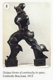
2. In the 20th century, avant-garde artists experimented with ways to represent movement.

Futurist artists used motifs, such as machines, animals, war and cities, to show the energy of motion.

3. Around 1960, a new movement called Kinetic Art emerged. In this type of art, the artwork moves or has an element of motion.

4. In some abstract artworks, the shapes and colours appear to move. This is due to the type of shapes used, as well as the composition and the contrast of colours. Some artists, such as those belonging to the Op Art movement, used geometric optical illusions and the psychology of perception to explore the sensation of motion.


Motion lines

In comics, the graphics that represent motion in characters and obiects are called motion lines.

Simple speed lines are a resource that show in which direction a character is moving quickly.

It can be done in several ways.


Reinterpret these photos using motion lines.
Use black felt-tip pens of different thicknesses.